Arquivo da Categoría: UX

IE9 Really Doesn’t Like It When You Take A Shortcut With Your <van> Etiquetas

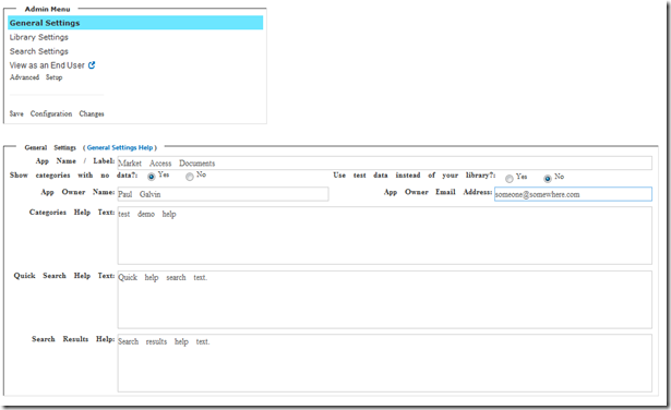
I’ve fallen into a bad habit of using Chrome all the time.  It’s “bad” because the stuff I develop really needs to run on a lot of other web browsers, incluíndo, sadly IE8.  My work laptop has IE9 standard for whatever reason) and I was just doing a quick check to see what things looked like and … it wasn’t pretty.  Por exemplo:

image

It’s *supposed* to look like this:

image


Not only was it off, but my click events weren’t firing.  (Most of them, de calquera xeito).

Visually, it looked like things started to go off the rails near the “Advanced Setup” link.  I dug into that part of the HTML and found that I had this line:

<span class="glyphicon glyphicon-new-window” />

That seems like allowable syntax (“Chrome version 40.02214.94 m” is fine with it). I went and changed it anyway, como se mostra:

<span class="glyphicon glyphicon-new-window”></van>

That fixed it.

Such a tiny little thing caused such a huge mess of a screen.  Fun times.

This happened to be a quick fix, but it’s also the kind of thing that just gets your spine out of alignment when you see it.  Hai máis de 500 lines of HTML in this little admin function and you just don’t want to find yourself digging amongst those weeds, ever sorriso.

</final>

undefinedRexístrate para o meu blog.

Siga-me no Twitter http://www.twitter.com/pagalvin
Creación de formularios personalizados do SharePoint sen unha Master Page

O meu compañeiro, Lauren Jones, wrote up a nice walk-through on how to create a custom data entry form using SharePoint Designer.  That’s not exactly “new under the sun” but there’s a bit of twist.  In her words:

Creating custom forms is straight forward to do in SharePoint Designer, navigate to your list and on the ribbon menu select ‘List Form’ and create your new form template.

This works well if you want your form to be attached to you master page, but what if you have the use case of creating a form that is in a popup window or is standalone without the SharePoint chrome. I had exactly this use case, I wanted to custom style a form then use that form in a popup div inline within a page.

Don’t despair, there is a way to do this which is not that intuitive but fairly easy to accomplish.

You can read all the details here: http://www.bigapplesharepoint.com/pages/View-An-Insight.aspx?BlogID=55&rtitle=customforms&rsrouce=pgblog and you can see it in action by clicking the “contact us for more information” link on any of the services on the services page of our Big Apple SharePoint site (http://www.bigapplesharepoint.com/services).

Lauren writes lots of good stuff on UX and branding.  You can see more of here writing here: http://www.bigapplesharepoint.com/team?showExpertName=Lauren%20Jones.

</final>

Proxecto perturbador e bêbeda no Recurso Coolaid

O meu compañeiro, Lauren Jones (https://twitter.com/laurenjones02) wrote up an short article talking about how overly complex SP rollouts are very hard on end users.  It’s sort of obvious, in a way, but it’s easy for me to say that after I’ve orchestrated a LOT of complex rollouts of things to unprepared end users over the years.

Here’s the key ‘graph:

Five years ago, when I rolled out SharePoint to an organization for the first time with a primary goal of becoming the collaboration platform and replacing share drives, we also introduced social and news feeds through RSS, My Sites and Profiles, and folksonomy tagging. Needless to say, this was a lot for end users to adopt in one swoop. While there was success with adoption around document management and profiles, RSS and tagging was less successful and this was really due to the change management communication and training. We couldn’t do it all at once. Taking the less is more approach and releasing functionality in phases is easier for end users to accept and adopt to.

This article reminds of another bit I read by Kris Gale related to Yammer’s feature set, "The One Cost Engineers and Product Managers Don’t Consider."

If you have a horror story or success story to share, I hope you’ll do that in comments over on the Big Apple site.

</final>

"Non queremos SharePoint ollar como SharePoint”

I’ve always been a function-over-form kind of person.  I’ll take a challenging user interface over something pretty any day – provided the payout is worth it.  Consider Dwarf Fortress :).  This is pretty difficult UI sitting on top of a complex simulation engine.  Aínda, I spent a bunch of hours (more than anyone would publicly admit to) learning that UI and playing the game.

So historically, when I heard customers say “We don’t want SharePoint to look like SharePoint,” I always thought to myself, “when they see in action, they’ll be perfectly happy with it.”  I have almost always – virtually every time – been wrong about that on some level.

O meu compañeiro Lauren Jones speaks to this topic aquí (http://www.bigapplesharepoint.com/pages/View-An-Insight.aspx?BlogID=28&stitle=splooks&rsource=pgblog).

I’m really interested in thoughts around this topic and the tension between how we “know” that SP is a good fit while overcoming look and feel issues (what I have always called “fluff” 🙂 ).

</final>

"Non queremos SharePoint ollar como SharePoint”

I’ve always been a function-over-form kind of person.  I’ll take a challenging user interface over something pretty any day – provided the payout is worth it.  Consider Dwarf Fortress :).  This is pretty difficult UI sitting on top of a complex simulation engine.  Aínda, I spent a bunch of hours (more than anyone would publicly admit tool learning that UI and playing the game.

So historically, when I heard customers say “We don’t want SharePoint to look like SharePoint,” I always thought to myself, “when they see in action, they’ll be perfectly happy with it.”  I have almost always – virtually every time – been wrong about that on some level.

O meu compañeiro Lauren Jones speaks to this topic aquí (http://www.bigapplesharepoint.com/pages/View-An-Insight.aspx?BlogID=28&stitle=splooks&rsource=pgblog).

I’m really interested in thoughts around this topic and the tension between how we “know” that SP is a good fit while overcoming look and feel issues (what I have always called “fluff” 🙂 ).

</final>